Although we are not all lucky enough to have houses by the sea, we are well aware of how a walk along a beach or a cliff can uplift the spirits, clears the head and makes us feel invigorated. We look at these coastal cottages and wooden houses in magazines and films and feel inspired by these calm tranquil retreats.
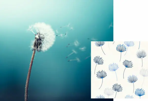
We can learn lessons from this decor and take inspiration from the colours we see along the shore. The blue sea, a cloudless sky and green moss clinging to a rock or a wild flower blowing in the wind.
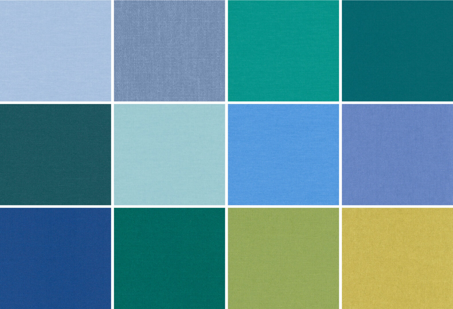
The colours of the shore, sky and sea
Colour can be used to signal action, influence mood and psychological reactions. Our senses are bombarded when entering a supermarket or department store. Millions are spent by firms every year analyzing the colour that will trigger us to shop.
Some colours will do that, but when we are seeking refuge in a calm inspiring space, blue, green and white will settle out psyche in a much more beneficial way.
Colours like features,
follow changes of emotion
Pablo Picasso
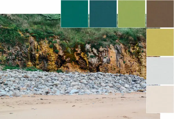
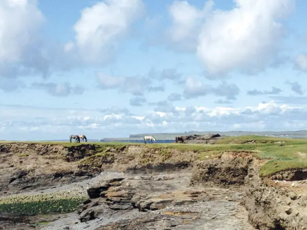
To bring the outside in, we looked at Co Clare for our inspiration, on the southwest coast of Ireland, a tiny village called Milltown Malbay renowned for traditional music, and where the Atlantic Ocean offers great surfing in the summer and bashes the coast with voracious force in the winter months. We looked over the jagged rocks onto frothy sea and are inspired by the many hues of blue, sand, green and white.
Colour is often the easiest way to shift the energy in a space, so the Feng Shui experts advise us. But what colour? For harmonious calm spaces we are advised to stick to the water and wood colour palettes (Feng Shui), so mainly blue and green, but depending on what area you wish to update, and how you want to make it feel should dictate which colours you use.
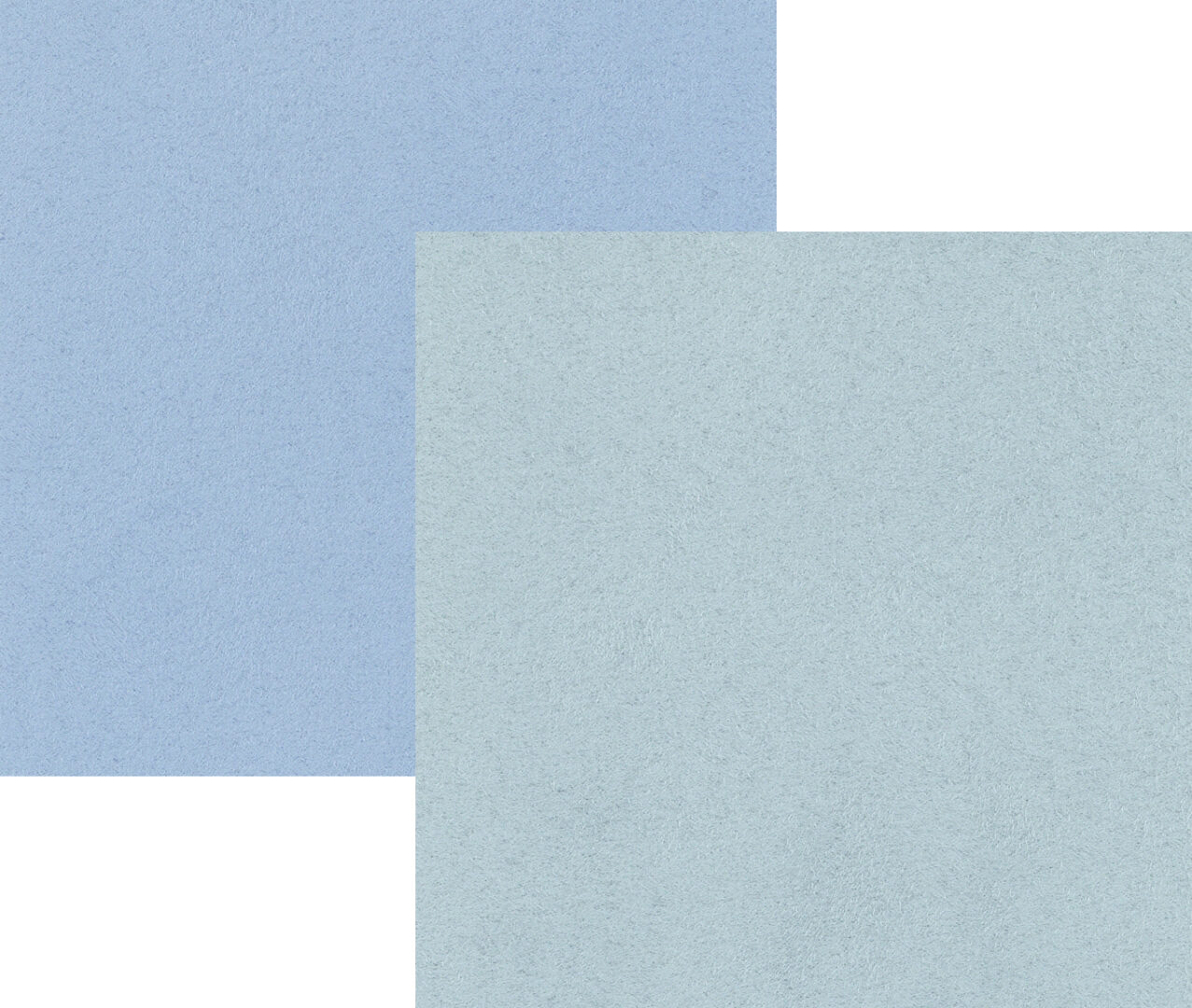
Blue, the colour of the sky and sea is thought to induce calm serenity, often used in the corporate world it conveys confidence and loyalty. To lie on our backs and look up to a cloudless sky, will slow our metabolism, so great for bedrooms and bathrooms.
The Atlantic Colour Palette
Indigo blue is the colour of intuition and perception and is often seen in traditional Japanese and eastern textiles as it is deemed to promote deeper concentration, important for those who meditate. Consider this colour for home offices or study areas.
Turquoise is a happy colour important for communication, encourages healing, emotions balance and stability. Add splashes of this to the dining room.
Green is the colour of balance and harmony in its deeper shades and in lighter kelly green shades it promotes growth and renewal. Green is said to restore depleted energy, so great for bedroom and relaxation areas.
White the colour of purity, innocence and wholeness will add brightness to dull areas and can add an air of openness and cleanliness, although in large quantities it can be cold and clinical , so add splashes of other colours.
Colour like music can affect our moods so choose carefully and consider the hues you use and mood you wish to create. Have fun and relax in a calming retreat.