

Colour trends are continually shifting and evolving. What is “on trend” one year is often quickly replaced with the latest craze or colour scheme. Fashion, interiors and design while all different markets are intrinsically linked by these colour trends.
However, the power of colour is not only about what is the latest in fashion or even personal choice but colour has the power to affect our moods, feelings and well-being. Leading brands have long since been well aware of this power and continue to utilise it in advertising, retail spaces and branding. How colour affects us relates not only to the commercial world but it is very much prevalent for our homes.
Look around the rooms in your home and you’ll probably pick up on a theme (or two). Colour is an expression of your personality. Sometimes we will break away from the norm, but most of us have a tendency to stick the shades we know and love.
Leslie Harrington, a colour consultant states: “What colour you paint your walls isn’t just a matter of aesthetics. It’s a tool that can be leveraged to affect emotions and behaviour”.
What does your room colour say about you?
Yellow & Orange

If you gravitate towards soft, warm shades associated with sunshine and roaring fires such as yellow and orange – you have a cheerful, welcoming personality. People who use warm tones tend to be friendly and nurturing and enjoy hosting people in your home,
Breathe life into your room with the delicate floral of ‘Citrus Calista’, this pattern effortlessly brings a freshness to any interior. ‘Lola Calypso’ is a sleek block stripe that incorporates bold contrasting colours with subtler subdued tones that will add cheer to any room.

Green
Green is currently the most popular decorating colour, as it symbolizes nature. In the kitchen, green cools things down; in a living room, it encourages unwinding but has enough warmth to promote comfort and togetherness for the whole family.
The soft tones alongside the bold confident colours of the ‘Napa Verde’ will add a feeling of warmth and elegance to any room. Unilux is ideal for kitchens or bathrooms due to its easicare technology which makes it easy to clean – however this does not mean you have to lose out on colour – add ‘Unilux Lime’ to add an instant pop of colour.

Blue
Blue tones symbolise trust, honesty and loyalty. This colour can also relate to peace and tranquillity and this is why this shade is popular in bedrooms as this is the place people like to go to relax and unwind.
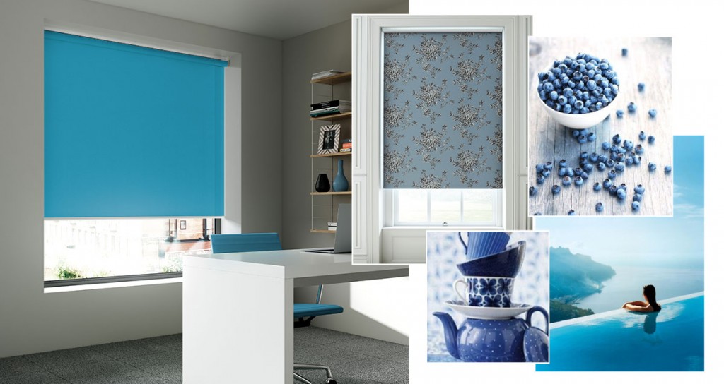
To help make your bedroom a more serene environment, use ‘Othello Insignia’ to add a touch of colour while the print will make you feel if you are in an enchanting forest. While a ‘Fleur Mineral’ vertical will also add a sense of calmness to any room.
Pink
Pinks hues demonstrate romance, affectionate and intimacy. They tone down the physical passion of red replacing it with a gentle loving energy. Pink represents the sweet and innocent in children and our inner child. The soft pastels and light dusky tones of the Bella range will bring a touch of elegance with confidence while adding colour. Young girls will love ‘Bella Kiss’ as it will instantly remind them of Barbie.
‘Farah Petal’ with the cherry blossom print will add a sense of calm to any room. To make the colour pink stronger and more sophisticated combine it with darker colours like dark blues, blacks or greys. The Fabric Box has the perfect material to add sophistication using pink, ‘Treviso Fuchsia’ is an elegant and enchanting fabric which is brought to life with boldly coloured trees which come alive on the grey metallic base.

Purple
Is your room reminiscent of jewel tones like ruby, emerald or dark purples, these colours lend an instant va-va-voom! You are probably outgoing, confident and creative.

These colours can make a room feel glamorous, create intimacy in an imposing space or play up the coziness in a small room. Let vibrant tones take centre stage from the Vitra collection creating a playful feel! Try a striking vertical to add some decadence to the room using ‘Vitra Passion’.
Neutrals
Do you prefer neutral tones such as grey, beige and ivory? This more than likely shows you are even-keeled and practical, and not interested in re-painting your rooms every few years because you’ve tired of the shades. This can also work in your favour as earthy walls allow you to use more colour in your accessories and furnishings.
The Fabric Box collection will give you plenty of options to help add colour to a neutral colour palette. A ‘Satina’ roller blind in crimson will inject instant life into your room, with the metallic leaf design set against the plain background, these delicate branches and leaves will glisten with the pearlised ink on the fabric.

If you are thinking of sprucing up a room or two in your home, keep in mind that colour choice is a very personal matter and you are the one who has to live with your new colour scheme, so choose a hue that suits you, your family and your lifestyle. The newest Fabric Box Collection offers more choice, styles and colours to help you add a pop of colour to any room. With over 350 rollers fabrics available there is something sure to suit everyone’s tastes.
